
“Dan Christensen: A Retrospective” a show at Berry Campbell (through October 17) drew scores of people to its opening reception, many of whom had to stand outside waiting in the street.
Since this is the inaugural exhibition of the gallery’s newly-expanded ground-floor space at 530 West 24th Street, it was particularly newsworthy, and I’ll get to that.
But it is not the only, or even the best, show of the lyrical spray-painter’s work in New York right now. The back room of the Leslie Feely Gallery, at 33 East 68th Street, is currently showing “Dan Christensen: Paintings from 1970 to 1989”—which for me is the most perfect little art show at this moment in New York.
The exhibition, which is also up through October 17, has just four paintings, everyone a winner, even though none come from the period when legendary critic Clement Greenberg was calling Christensen ”one of the painters on whom the course of American art depends.”
He was doing wonderful spray paintings at the time –with narrow colored lines that looped and whirled about.
These lines were created by the tight nozzle of a spray gun, swooping up, down and around the surface of the canvas—the middle of it as well as its periphery..and right around 1968 and 1969, he was hot, hot, hot.
His popularity cooled, as some artists’ do over decades, but not before he earned a spot in major museum collections. And since his death in 2007, according to the “selected” list of solo exhibitions at the Christensen website, his work has been seen in four gallery exhibitions at Spanierman, which represented the estate, five at Lew Allen, in Santa Fe, and one at Elaine Baker, in Boca Raton.
He has also had a retrospective at the Kemper Museum of Contemporary Art in Kansas City, which traveled to the Sheldon Museum of Art in Lincoln, Nebraska.
That’s a lot of exposure, more than one show a year, and I feel sure that all these shows have given a lot of pleasure to their viewers.
Enough pleasure so that over the years, I would imagine, a lot of these paintings have been sold.
How many are left in the estate – to which Berry Campbell has succeeded – I do not know.
All of which brings me to the current show at Berry Campbell. As it’s a major exhibition, with 24 paintings on its checklist, I very much wish I could rave about it from beginning to end, but I’m afraid that I found it uneven.
Whether this situation is due to poor selection, or whether the show’s organizers simply did the best they could with what they had, is not for me to say. I can only record my response to what I saw on view.
Some of the work in this show I thought might be of historical value, fit for a study collection somewhere or of interest to somebody who has assembled a huge collection of the greatest Christensens and wants to surround them with work showing where they came from, maybe even where they went.
Some of the rest of the paintings in the show did nothing for me. Other viewers may feel differently—and I’m not going to linger on work that for me didn’t come off. Rather, I shall focus on the triumphs.
To begin with, there is the one big picture from the period when Christensen was at the top of his game – and the top of his fame.
This picture is Dorado (1968). Its sprayed-on lines swing along–up down and around, but in an unpredictable, wildly, and most enjoyable irregular pattern– like a lunatic ballet dancer or the music in a marching band on Oxycodone. Terrific!
Also important is the smaller untitled painting from 1967, with a heavy pile of layered dark pink stripes atop a field of massy blue.
This is a transitional painting from the minimalism that Christensen had adopted when he first came to New York and the lyrical abstraction of his “Dorado” period—but beyond that, worthwhile in its own right, very tight and neat and sober.
The earliest painting in the show, a 1966 untitled work, belongs to Christensen’s minimalist period, with vertically-piled rows of short golden strips on a puce-colored field.
I see this as the ugly duckling before the swan – but it may also be one of those works that appeal to collectors with an interest in Christiansen’s roots—or those legions of art lovers who care more for minimalism than color-field anyway
Christensen returned to sprayed-on lines at two later stages in his career, in the late 80s and early in the 21st century.
In the 80s, these sprayed-on lines were still as soft and fuzzy as they had been in the 1960s, but they were regular and more likely to circle the perimeters of the canvas as opposed to arching straight across it.
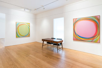
Some of the colors could be lovely, too, as with Fandango (1988), with ovals in the center of the canvas of yellow, blue and red on a pinkish field.
Fandango is hung horizontally in the show and reproduced vertically in the sweet little catalog—looks grand either way.
Also worthy of mention are Couvade (1979) and King’s Point (2002).
In the last years of his life, Christensen used the spray gun to create pencil-thin lines in heavy paint. These are inscribed as a series of regular loops resembling a Slinky on opaque fields of color, often in smaller paintings.
Most of these Slinky-like pictures remind me of the miniature targets that Kenneth Noland was making at about the same time: both struck me as attempts to revisit former glories on a more salable scale but suffering from the weakness of old age.
Still, occasionally these late Christensens do come off, as witness the zinger Green Glow (2004). With its roll of loops of reds & greens on a mustard field, it looks divinely cool over the reception desk and decorating the catalog cover.